Brand identity


GAIN logo

The GAIN logo should always be displayed in such a way as to ensure that the words “Global Alliance for Improved Nutrition” are legible. In exceptional circumstances - where space is restricted, for example on the spine of a book - the bowl of grain and the acronym “GAIN” can be used without fully spelling out the name of the Foundation.

The different variants of the GAIN logo are available below. Please contact the communications team at communications@gainhealth.org for permission and guidelines before using the GAIN logo in any capacity.

You can also download the full Brand guideline

PRIMARY COLOURS

In general, the background should be white and the text should be black, except for keywords and titles, which should be in red or secondary colours


GAIN RED
C0 M100 Y63 K29
R178 G9 B51
HEX #B20933


WHITE
C0 M0 Y0 K0
R255 G255 B255
HEX #FFFFFF


BLACK
C50 M40 Y40 K100
R0 G0 B0
HEX #1D1D1D1B


GREY
C0 M0 Y0 K37
R183 G184 B184
HEX #B9B8B8

SECONDARY COLOURS

These should be used as additional colours for text boxes, infographics, charts, maps, icons, etc. Secondary colours can also be used occasionally as backgrounds.


YELLOW
C0 M15 Y95 K0
R255 G216 B13
HEX #FFD80D


LIGHT ORANGE
C0 M35 Y96 K1
R253 G165 B9
HEX #FDA509


DEEP ORANGE
C0 M52 Y87 K0
R255 G123 B34
HEX #FF7B22


LIGHT GREEN
C23 M0 Y52 K38
R122 G158 B76
HEX #7A9E4C


DEEP GREEN
C77 M0 Y100 K56
R25 G111 B0
HEX #196F00

FOR DIGITAL USE AND BACKGROUND ONLY

These should be used solely for digital communications and backgrounds with overlayed black text.


LIGHT YELLOW
C2 M5 Y45 K0
R253 G236 B165
HEX #FDECA5


LIGHT GREEN
C31 M10 Y40 K0
R162 G206 B170
HEX #C0CEAA

Do's

Wherever possible, the GAIN logo should be presented in colour on a white background. It is acceptable for the logo to be reversed out on a coloured background and for the logo to appear in white. The GAIN logo can appear in black only on a black and white document. No other colour should be used for the GAIN logo.

GAIN logo colors


Don'ts

Never change proportions, colours, typefaces or language of the logotype. Examples of unacceptable use of the GAIN logo:

Dos's and don'ts


KEY MESSAGES
Book Antiqua (Bold)

Improving people’s diets to reduce malnutrition.

Book Antiqua should be used for key messages only and always in Bold. You can highlight keywords in bordeaux for greater impact. This font is available on all Microsoft programmes (Word, Excel, PowerPoint, etc).

TITLES
Avenir Black (or Arial Bold)

THE MARKETPLACE RWANDA

SUBTITLES
Avenir Black (or Arial Bold)

THE MARKETPLACE RWANDA

TEXT
Avenir Book (or Arial)

Lorem ipsum dolor sit amet, ad his vidit facilisis, veri probatus petentium vim at. Alii dolorem singulis at mei. Interesset interpretaris ut mei, pro vidit harum maluisset te.

Titles and subtitles : use uppercase for short titles (less than 50 characters including spaces). If more than 50 characters, use lowercase.

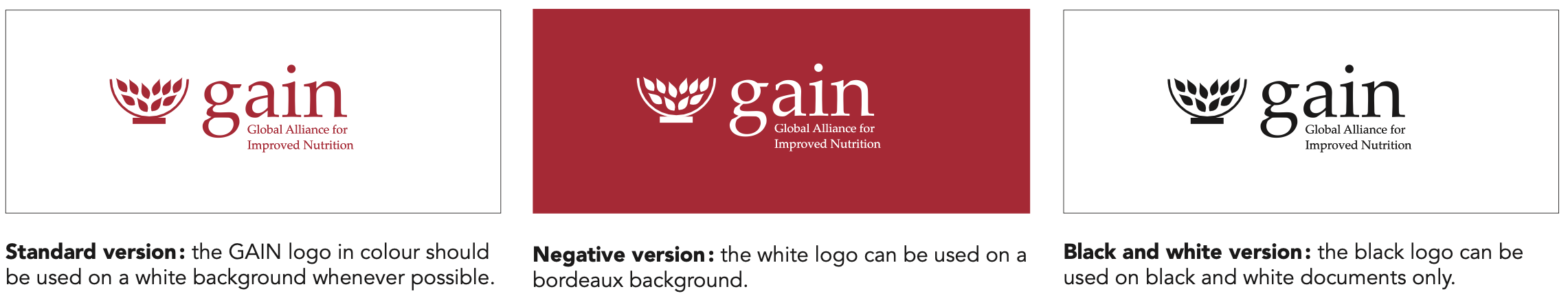
Colours: the text should generally be black on a white background. The red bordeaux is used to highlight keywords in key messages and titles only.

Fonts: for titles and subtitles we use Avenir Black and for normal text we use Avenir Book. Both fonts can be downloaded from the web on PCs. If you can’t download these fonts, please use Arial Bold for titles and subtitles, and regular Arial for normal text.

Style: please do not “justify” text. All texts should be aligned to the left.