The Food Systems Dashboard: Then and Now
30th/Sep/2025
30th/Sep/2025
Five years ago, fragmented food systems data made it challenging for stakeholders to take away meaningful insights for evidence-based decision-making. Today, the Food Systems Dashboard has transformed the data landscape and become an indispensable resource for food systems stakeholders worldwide, providing nearly 200,000 users with comprehensive, visual data and expert analysis that can help turn data into action and insights into impact.
The Dashboard was founded by Lawrence Haddad and Jessica Fanzo and launched in June 2020. This collaborative initiative is co-led by the Global Alliance for Improved Nutrition (GAIN), the Columbia Climate School, Cornell University's College of Agriculture and Life Sciences, and the Food and Agriculture Organization of the United Nations (FAO), with contributors from numerous other institutions.
When food systems data is poorly visualized, there can be real-world consequences. Decision-makers may miss warning signs, overlook successful interventions worth scaling, or miss unintended trade-offs between policies aimed at different outcomes. Clear, comprehensive data visualization transforms these challenges into opportunities — enabling leaders to better understand their food systems and the complex relationships between nutrition, livelihoods, and the environment that shape effective food systems policy.
From the beginning, the Dashboard has aimed to make food systems data accessible and actionable. To achieve this, the Dashboard is organized around three main pillars:
This data-driven approach has already enabled more informed, targeted, and impactful policy decisions around the world, empowering decision makers to address their food systems’ greatest challenges.
The Global Food Systems Dashboard now brings together over 300 indicators from over 40 sources, covering more than 220 countries with up to 60 years of historical data. Country Dashboards — co-created with country governments and already available in Bangladesh, Indonesia, Kenya, Mozambique, Nigeria, and Pakistan — also bring together subnational data that is critical for effective interventions. These indicators span the entire food system: agricultural production, food availability and affordability, diets and nutrition, livelihoods, climate, environment, resilience, and governance — and external drivers that influence all these factors.
Bringing together data across the food system all in one place shows the connections between different outcomes and helps identify contributing factors. For example, the Dashboard includes diet data from the Global Diet Quality Project, including the newly adopted SDG indicator MDD-W: Minimum Dietary Diversity for Women (SDG 2.2.4). This data can be viewed alongside gender equality indicators, such as the Gender Inequality Index, as well as upstream indicators on food availability, such as availability of fruits and vegetables, and food affordability, such as Cost of a Healthy Diet. Users can monitor MDD-W and explore potential contributing factors to better target interventions where needed.
When the Dashboard first launched, it was primarily focused on diet and nutrition outcomes. The team has since made dedicated efforts to widen this, first adding environmental outcome indicators, and then also adding livelihoods, governance, and resilience indicators from the Food Systems Countdown Initiative — a collaboration uniting over 60 food systems experts from dozens of institutions worldwide to monitor food systems transformation. The Dashboard team is continually evaluating and adding new indicators. While global data provides the big picture, real transformation happens at the country level.
Recognizing that national-level data alone is insufficient for food systems transformation, the Dashboard team has pioneered the co-creation of Country Dashboards featuring crucial subnational data. These platforms — developed in close partnership with governments, civil society, and academia — ensure alignment with local priorities and decision-making needs.
The first Country Dashboards launched in Bangladesh, Indonesia, Kenya, Mozambique, Nigeria, and Pakistan, collectively covering nearly one billion people. A key strength of this approach is the pathway to full government ownership, already realized in Indonesia, where the Ministry of National Development Planning hosts their Dashboard, and Kenya, where the Ministry of Agriculture and Livestock Development incorporated their Dashboard into their KilimoSTAT database.
Governments are already using these Country Dashboards to drive policy change. Bangladesh is using their Dashboard to inform their Plan of Action for the Food Systems Pathway, Indonesia is employing their Dashboard data to support Regional Food and Nutrition Action Plans, and Pakistan is incorporating their Dashboard insights into their Food and Nutrition Outlook report. The Country Dashboards are also being used by other food systems stakeholders. Civil society organizations in Nigeria used the data to advocate for increased wages, achieving a 134% increase in the minimum wage, and educational institutions in Pakistan are integrating their Dashboard into higher education curricula.
Initial successes have led to strong demand for more Country Dashboards, currently being developed in Brazil, India, Ethiopia, Mexico and Rwanda, which will expand coverage to nearly three billion people.
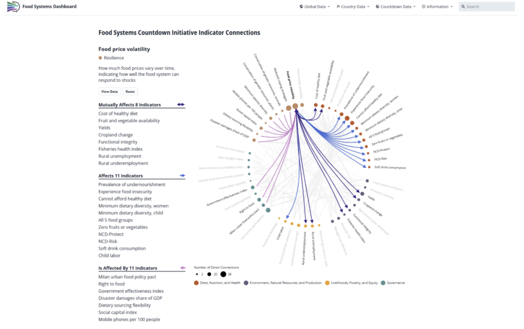
The Dashboard also serves as the home for data from the Food Systems Countdown Initiative, which developed a global monitoring framework comprising five themes: (1) Diets, nutrition, and health; (2) environment, natural resources, and production; (3) livelihoods, poverty, and equity; (4) governance; and (5) resilience. The Countdown then undertook a consultative process to select a set of 50 indicators across these themes. These indicators have been used by the United Nations Food Systems Coordination Hub, the Comprehensive Africa Agriculture Development Programme (CAADP), and AGRA. Through the Food Systems Dashboard, users can access all 50 Countdown indicators via specialized Country Profiles and an innovative interactions visualization tool that reveals synergies and trade-offs between indicators.
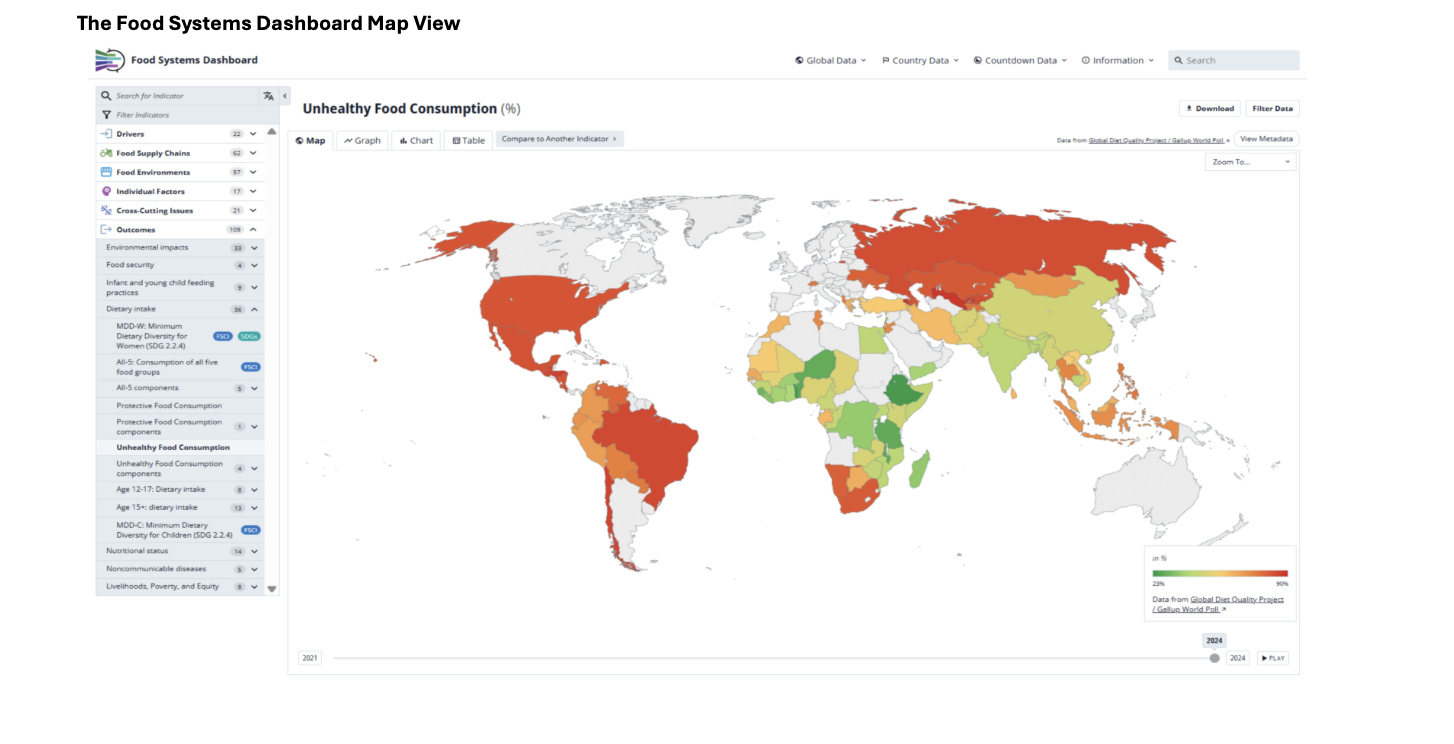
The Food Systems Dashboard team not only focuses on what data is included in the Dashboard, but also how this data is visualized to maximize understanding and impact. Users can visualize the 300 indicators through intuitive maps, graphs, and tables. This summer, the Dashboard launched extensive improvements to these maps and graphs that allow for easier interpretation of the data. With clear color schemes, users can quickly see which indicators have a desirable direction. They can identify successes based on which countries and regions are shown in green and challenges based on which countries and regions are shown in red. This allows users to also explore patterns by country, region, food system type, and income group.
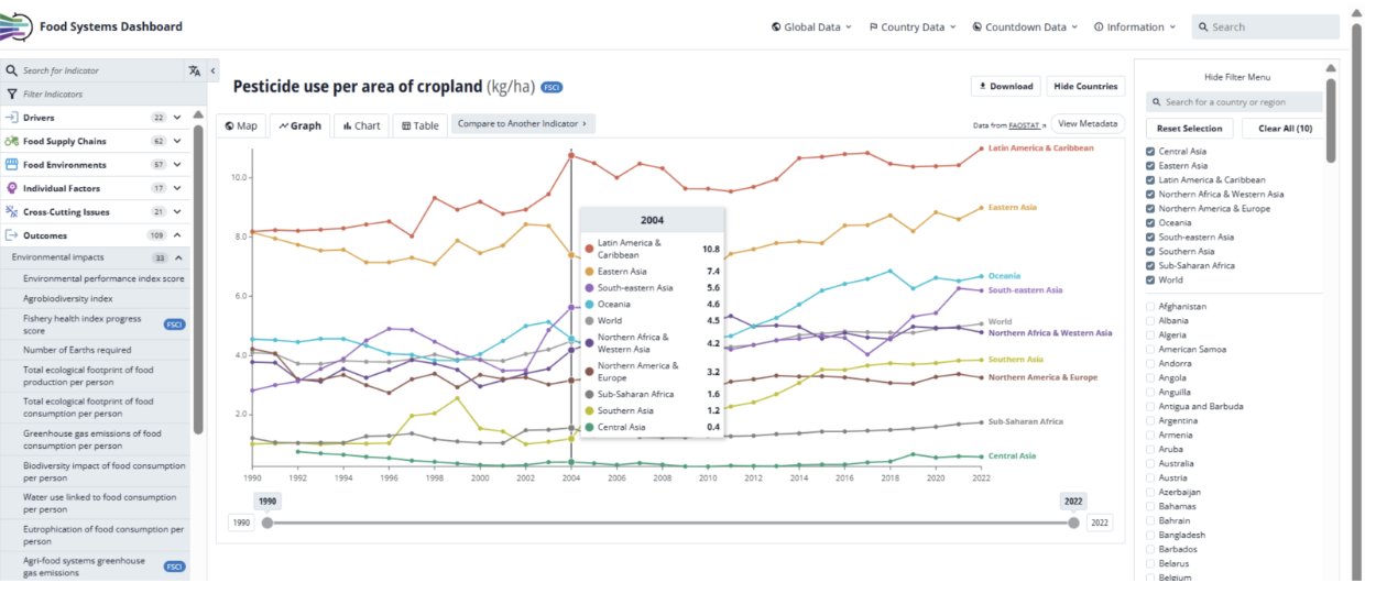
The graphs also include new design features that aid in data interpretation. Users can easily customize graphs by adding region, food system type, and income group means or countries of interest. They can also see values at each time point for easy comparison.
These improvements have reduced the time and skill users need to interpret complex data patterns, enabling faster identification of intervention opportunities.
By combining comprehensive data, expert analysis, and powerful data visualizations, the Food Systems Dashboard is transforming how we understand and improve food systems worldwide —-one evidence-based decision at a time, with even more innovations on the horizon.

Research Advisor - Knowledge Leadership

Senior Technical Specialist

Research Lead, Food Environments and Supply Chains

Columbia Climate School