This episode of Bite the Talk explores the Food Systems Dashboard, a global platform designed to bring together scattered food systems data into one clear, user-friendly space to help people understand what’s working and what isn’t across food systems.
Guests Dr. Jessica Fanzo and Dr. Ty Beal explain how it was built through global collaboration to combine trusted indicators on nutrition, health, environment, and livelihoods, while ensuring accessibility and practical use for policymakers, researchers, and educators.
Transcript (Click to View)
Mark: Welcome back to Bite the Talk, the podcast where we dive into the ideas, policies, and tools shaping how we feed the world. I'm your host, Mark Gachagua. Today we are talking about something that might sound technical at first, but trust me, it's exciting.
Mark: That is the food systems dashboard. Think of it as a global control panel for food systems, helping us see what's working, what is not working, and how can we act. And to help us unpack it all, I'm joined by two fantastic guests.
Mark: One, I have Dr. Jessica Fanzo, who is a professor of climate and the director of the Food and Humanity Initiative at Columbia University's Climate School in New York City. Dr. Jessica was also the co-chair of the Global Nutrition Report and team leader for the United Nations High- Level Panel of Experts on Food Systems and Nutrition. She currently leads the development of the Food Systems Dashboard and the Food Systems Countdown 2030 Initiative in collaboration with the Global Alliance for Improved Nutrition.
Mark: Welcome to the podcast, Dr. Jessica.
Jessica: Thanks for having me.
Mark: I hear people calling you Jess.
Jessica: You can call me Jess. Yeah. We're friends!
Mark: Thank you. Thank you so much. I'm also very, very pleased and honored to have Dr. Ty Beal, who serves as the head of Food Systems Data and Analytics at the Global Alliance for Improved Nutrition, where he translates complex research into actionable insights for global nutrition.
Mark: And we do really need that. Now, Dr. Beal serves on expert advisory groups for UN organizations, including WHO, FAO, and UNICEF, and regularly engages broader audiences through conferences and media platforms. Ty, welcome to the podcast and congratulations on your new podcast, The Ty Beal Show.
Ty: Thanks, Mark. I'm glad to be here.
Mark: Yeah. So, we're going to explore four big questions. Why was the dashboard created? How was it built? Who is using it? And perhaps, most importantly, what next for the dashboard? In our first segment, let's start with the basics. What problem were you trying to solve when the food systems dashboard was first conceived, Jess?
Jessica: Yeah. So, you had mentioned the high-level panel of experts on food systems and nutrition. And I was leading that report along with my colleague Lawrence Haddad, who is the Head of GAIN, the Global Alliance for Improved Nutrition. And as we were working on that report, we saw that there was a lot of food data out there, but it was sort of in all these different places. And, there's a lot of food databases, but they're very complex to navigate. And Lawrence and I were thinking, wow, wouldn't it be great if we had a simple, easy to understand, very visually appealing kind of database or dashboard that centered more of the health and environment indicators that anyone could access from anywhere in the world. And that's where we started.
Jessica: So, we saw this gap in the kind of food systems databases and data that were out there. And we really wanted to make a tool that anyone could navigate and they could easily understand. So, what you see a lot of the time are policymakers, UN, NGOs, colleagues.
Jessica: They had to go to all these different places to be able to access data. And it became quite challenging to understand how food systems are characterised. So that's what we did with the dashboard.
Jessica: It brings together about 40 sources into one, what we think is user-friendly platform. And Ty's worked very hard with our friends, our group on the dashboard to make it as easy as possible where people can go and explore data and see how food systems are characterised and performing. And we have a lot of other kind of tools that we've been adding over the years that we can talk about.
Jessica: But that was really where we started. We saw a big gap and the dashboard that is centered on food, particularly with nutrition and environment, that could be an education tool and a tool that's easy for policymakers to navigate without having to be so savvy in understanding how to navigate data.
Mark: Thank you, Jess. It's always nice to see or to hear about efforts of making these data interesting.
Mark: Ty, we've talked about experts and I was just wondering if you had to explain the dashboard in one sentence, for example, let's say to a very curious farmer or a shop owner in Jakarta, how would you put it?
Ty: That's a great question. It's really a map of your food system from farm to fork. So, this includes everything from impacts on our health to livelihoods in the environment. And it shows you where things are going well and where they need attention.
Mark: Yeah, thank you, Ty. There's always the temptation of, you know, having more. And some people say less is more. I've interacted with the food systems dashboard and I know we have hundreds of indicators, of course, from dozens of sources. How do you decide what to include and what not to include? I feel like that's a very interesting conversation you guys must have had.
Jessica: Yeah, we debated this a lot. And, you know, you could be in a situation where you have a bit of, as we call it, death by data. You just have too much data that you don't know really what to parse out and how to navigate that. So we worked with a lot of global experts balancing that scientific rigor and what are sound data and indicators with what data is usable and informative for decision making. So, the indicators on the dashboard are meant to be a curated set. So, users can be confident that they are high quality indicators from trusted sources, like the Food and Agriculture Organization and World Bank. But they're also meant to create a bit of data equity in that we try to pick indicators where we have a lot of countries that are covered across different regions and income groups, because a lot of times you'll go to some food dashboards and it's a handful of high-income countries because that's where you see a lot of data. So, we were really purposeful ensuring that we chose indicators where a lot of countries could be represented on the dashboard.
Jessica: And finally, we tried to ensure that the dashboard is easy to understand and actionable. So, because of those criteria that we set up, not every indicator made it in from the decision-making group that we have, but we have over 300 indicators and we chose those really across what you would call a food systems framework or a map. We made sure that we had indicators around agriculture production, food environments, food supply, what kind of food is available, what kind of food is affordable, the access piece.
Jessica: And of course, then outcomes, health, nutrition and diet outcomes, livelihood outcomes, environment and climate outcomes. And then we have some driver indicators, drivers that are shaping and shifting food systems in different directions. So that could be urbanization, governance, resilience type indicators.
Jessica: So, we were very purposeful in ensuring that we're looking not only at the components of food systems and the outcomes of food systems, but also some of the drivers of food systems. We were quite selective in how we framed that and put those into the dashboard.
Mark: Yeah, thank you, Jess. And I think this is it's always nice to understand how, you know, things are working in the background and actually notice some policy is a policy recommendations or policy actions within the dashboard. And I think that was a really, really interesting move, you know, not only to have the indicators and to have all these data, but also kind of suggest how it could be utilized for, you know, towards making better policies or even maybe implementing them. Jess, you mentioned a couple of organizations, FAO and the World Bank, and I'm thinking partnerships obviously had a huge role in this whole thing.
Mark: Who came together to make this happen? And why was collaboration so important in working on the dashboard?
Jessica: Yeah, we brought together a lot of different people with different expertise, particularly in the food system science field. Before I was at Columbia, I was at Johns Hopkins University and Rebecca McLaren, who probably many of you who interact with the dashboard have interacted with. She's our global coordinator on the dashboard.
Jessica: She was with me at Hopkins and we working with the Global Alliance for Improved Nutrition, Lawrence, Ty, who's here and Stella Nordhagen came together with FAO, as well as some other experts out of Cornell, University of Michigan, some collaborators on the CGIAR, which is the Agriculture Research Body, University of Edinburgh, and others. So, it was quite a nice mixture of academics, UN, NGOs who really understand food systems data. And we had to do that because not all of us are experts on every aspect of data across food systems. So, we had to bring collectively a lot of different people together to debate and hash out what kind of data do we want? How should we display it? What makes sense? So, it really helped having that global collaboration and bringing lots of experts together.
Mark: That's good. That's good. You know, I'm just thinking about the process and I mean, sounds really, really nice and a very nice and harmonious partnership coming together to develop the dashboard. Ty, I'm just wondering, was there any interesting challenge during this development phase that you would like to share with us?
Jessica: Be gentle, Ty!
Ty: Jess, it was great. I still feel like the dashboard calls are sort of like a family, you know, it's sort of like we're all friends. And I think that's one of the most rewarding aspects of this, other than the actual impact this is having, like working together with great people. You know, I think that's just a really fulfilling thing to be involved in.
Ty: But there were a lot of challenges along the way. One of the biggest issues, when you think about food systems, diets usually are top of the mind, right? What are people eating around the world? That should be easy. Let's just put it on the dashboard.
Ty: Well, actually, that's not the case. We, you know, we've sort of found that there's this FAO, you know, Food and Agriculture Organization, food balance sheet data, which is this food supply data, shows you kind of a rough idea of per person, you know, how many calories of each different foods are sort of there, but it really doesn't tell you how much people actually eat. And so we were looking into data for a long time, looking at, you know, some modeled estimates, but realizing there's a lot of limitations there because the data is so scarce.
Ty: And so, we had a sort of sister project called the Global Diet Quality Project. We worked with Anna Herforth, and she kind of developed this dietary survey called the Diet Quality Questionnaire. We're able to get it implemented into the Gallup World Poll in over 90 countries now. And so that enabled us for the first time to have this data on what people are eating. And that really helped us shed some light on the diet quality of populations around the world, including, thankfully, this new indicator from the Sustainable Development Goals called minimum dietary diversity for women. And so, we're able to include this indicator and show how are countries performing on this in different parts of the world. And hopefully, eventually, we'll be able to see trends over time as well.
Mark: Thank you, Ty. I mean, that's really interesting.
Mark: I'm guessing with time, you know, the dashboard itself has evolved, you know, from this number of indicators, adding more features, you know, what is the thinking behind these, you know, this transformation, Ty?
Ty: So, for, I get to see Jess smiling. For all those who know me and work with me, I could be a little bit, how do you describe it? Particular about design and visualization. And so, I think I really have this passion for wanting to make this data come to life. And it's really hard to visualize data well in a static form. It's even harder to do that into an interactive display on a website, right? And so, I did some prototypes using some AI support to help get an example of, you know, what, what could this look like to redo it? And we were able to work with the web developers to take that and make it come to life and add all sorts of functionality. So now we can see trends, you know, when you hover over a data point on the map, you can see graph views where you can select the country and you can distinguish between the different countries.
Ty: You can see the data points and how they compare. You can make different graphs and they're really user-friendly and you can try to take a snapshot if you want. You can email, email that to someone or put it in a slide. And so, we feel that this, you know, even without any change of the actual underlying data, the visualizations are so important for how people actually learn and have gained insights about the data that this really helped us, you know, just very recently, it's just launched a month ago or so. And we, we feel that we've heard lots of feedback that now users are really able to understand what's going on in a new way. And so that sort of was the thinking behind that transformation. And, it's been a work in process for sure over the years.
Mark: Yeah. And I like what you mentioned AI and you know, keeping up with the times and AI seems to be, how can I put it, changing really fast or rather developing really fast and becoming so good.
Mark: How hard would you say, or how easy was it to incorporate AI in, in dashboard data and things of that nature, specifically for the food systems, that dashboard?
Ty: You know, Mark, that's something we've been wanting to do for two years now. And we haven't really, we haven't really cracked the code. I think it's going to happen.
Ty: That's sort of on our radar. We really want to have a natural language processing capability where users can just type in, you know, how many hungry people are there in this country, or, you know, certain questions that may not be the exact phrasing of the indicator, but then the AI in the background can be sort of pointing, pulling up that information and mapping, you know, bringing users to those visualizations. We haven't been able to do that.
Ty: You know, we were able to use AI to help generate some prototypes with visualizations. I think that was very helpful, but I think the next step is really taking this to another level where users can interact with it in a conversational manner.
Mark: I agree. I agree. I mean, still keeping up with the theme of use and how the dashboard could be used. Jess, do you have any examples that you want to show how other groups are using the dashboard to make decisions? I'm sure you, you know, over time you have observed a few things.
Jessica: Yeah, I mean, of course, the dashboard has some analytics that we can look at to see, you
Jessica: know, who's looking at the dashboard, what pages do they spend time on, where regionally are people, are people coming from when they're coming to the dashboard. But we do have some really nice examples where the dashboard has been quite useful. So for one thing, the dashboard has all the data from a sister project called the Food Systems Countdown Initiative, which has been a project ongoing for the last five years, where it brings together about 60 food system experts from about 32 organizations representing every region of the world.
Jessica: And that project is monitoring food systems. And what it's done is we've taken these 60 people, we've put them into five working groups, diets, nutrition, and health, environment, natural resources, and production. The third is livelihoods, poverty, and equity. The fourth is governance. And the fifth is resilience. And that governance and resilience groups are these cross-cutting groups.
Jessica: And these 60 experts came together and decided, okay, it's really difficult to monitor food systems. What can we do to make this easier? How can we start holding governments, private sector, those working in food systems to account by tracking how food systems are performing? And so, this group came up with a set of 50 indicators across those five themes. And we've been tracking these indicators.
Jessica: So, when you go to the dashboard, you can play with these 50 indicators. And that has drawn a lot of people to the dashboard because they want to look at those countdown indicators. There's countdown country profiles that people can look at, looking at a country's food system. And of course, there's a nice visualization tool to look at how these indicators relate to each other. It's a nice visualization tool. And that is all hosted on the dashboard.
Jessica: So, a lot of people who are interested in the countdown have now been drawn into the dashboard, which is a nice marrying of those two projects. Some organizations and initiatives have also used the countdown and the dashboard into their work. FAO is a user of this information.
Jessica: The Food Systems Coordination Hub, which is responsible for keeping the UN Food System Summit promises alive. Scaling Up Nutrition Movement is an important player in the nutrition field. They've used the countdown and dashboard.
Jessica: The Comprehensive Africa Agriculture Development Program, CADAP, very important on the continent, has been consistently one of our main users of the dashboard and countdown. And the Alliance of Champions for Food Systems Transformation, or ACF. Also, we were really pleased to see that FAO used what are called the dashboard typologies.
Jessica: These five food system typologies developed by one of our teammates on the dashboard, Quinn Marshall, who's at the International Food Policy Research Institute. FAO used those typologies in a really important report, one of their annual reports called the SOFA report, and that was in 2024. We were really pleased to see those typologies in that report and really shaped how they were looking at food system transformation.
Jessica: So, we've had a lot of different organizations tapping into both the dashboard and the countdown together.
Mark: Thank you, Jess. And I think it's really nice to talk about how the dashboard is being used. And you just mentioned the Comprehensive Africa Agriculture Development Program, also known as people call it CADAP. And earlier this year, we had the Kampala Declaration, and they're pushing more towards food systems. And I'm guessing this will be, you know, a very big opportunity for them to dig out more data, to kind of understand the policy context, and also the development context in Africa, based on the commitments that the heads of state came up with, which are really, really ambitious, and I must say are nice. Beyond the organisations, I'm sure some governments are using this dashboard, Jess.
Jessica: Yeah, and that's really who we wanted our audience to be, were governments around the world, where they could look at how their countries are doing on their food systems, how they're performing, and how they can start monitoring their food system. So, country governments are key users. And we have a set of country subnational dashboards that are on the global dashboard site.
Jessica: And we've already launched six of these subnational country dashboards in Bangladesh, Indonesia, Kenya, Mozambique, Nigeria, and Pakistan. So that covers about a billion people. Now, they're really interesting because these were country-led.
Jessica: What kind of data do country stakeholders think is the most important data? What kind of data do they have available sub nationally? And how can they start tracking that? So these were very country-led dashboards that GAIN and the dashboard team helped facilitate. We had our hands on their back while they led those dashboards. And I think you're going to be talking about that in another episode.
Jessica: I would say beyond just the country governments, there's also a lot of educators who use the dashboard and a lot of students. I use it in my class. I know a lot of other professors around the United States as well as abroad and other countries that are using the dashboard as a tool to drive discussions in classrooms and get students thinking about problem solving across food systems. And that's not only at graduate level where I teach here at Columbia University, but we're seeing young students use it in primary school, et cetera. And Pakistan and the Pakistan subnational dashboard has been integrated into their higher education qualifications, which is amazing. And we hope to spread that more if countries find some of these subnational dashboards useful, educating young future leaders in food systems.
Mark: Yeah, Jess. Actually, it's nice that you mentioned Pakistan. We just had a conversation with, was
Mark: it last week? We had a conversation with Faiz, who is based in Pakistan, and he told us about the new course, food systems course and how they use the dashboard So this is really, really important. And this has reminded me of a presentation I made, I think, was it in 2023, when we had the GAINS board and senior management and had this opportunity to talk about the dashboard. So, I can say that I've used it.
Mark: Yeah. Don't tell anyone. But, you know, I was just thinking about it and I told, you know, in my spirited and very passionate, you know, presentation, I just told the people who are there, I just told them that development without data is like driving a car at night without headlights. And that's what we need. We need a lot of data, especially on food systems. And the dashboard not only provides data, but credible data.
Mark: Now, Ty, I want us to think of something, you know, and this is something which actually has happened to me. Imagine you're in an elevator or in a hotel lobby and you meet one of the ministers for agriculture and you have very few seconds to talk to them and perhaps in a position where you need to pitch to them and talk to them about the dashboard. You know, what would you say? I'm curious.
Ty: That's a really good question. I think I would say something like imagine having all of these indicators, you know, not just for agriculture, but the entire food system all in one place. So that really is what the food systems dashboard is.
Ty: Not only can you see this sort of descriptive data about your food system, you can view diagnostics about how it's performing in each indicator compared to benchmarks. And you can really see how these indicators interact with one another. So that would be my pitch at a sort of high level.
Ty: And I'm sure there will be follow up questions from there. But it's really, you know, a hub for all of this food systems data in one place.
Mark: I would be nervous to make that pitch by some very confident Ty. And I mean, just tying into what you just said, how does the future look for the food systems dashboard? I know we have many ambitious plans and this discussion about food systems is it's growing bigger by the day, you know, what's next for the dashboard, Ty?
Ty: Yeah, I mean, I mentioned this before, but we really are working with partners to see how we can integrate AI to make it more of this exploration, intuitive, natural language queries, where users can just type in a question or something and get, you know, make it more accessible. So right now, it is there are nice visualizations, but some people may not really understand exactly what the graph is saying. And so there may be a lot of questions that the users have.
Ty: So that's our hope, is to really help users be able to make sense of things and be able to ask questions, interact with it using natural language prompts, and then also helping to understand not just the diagnostics about how your food system is performing, but really linking that to how do we make decisions to improve the indicators where performance is sort of lagging behind. And that link between the diagnostics and decisions, I think, is the next step that we're really hoping to get onto this. And really add to these country level dashboards where country decision makers have the tools, they need to make better decisions to transform their food systems.
Mark: Thank you, Ty. Do you want to add to that, Jess?
Jessica: Yeah, I mean, I think on this decision making, you know, one thing that we're doing as part of the countdown initiative is that across those 50 indicators that were established and that we've been monitoring, we're actually setting benchmarks to assess food systems performance. So countries can look at those 50 indicators and say, OK, where am I at as compared to my region? Or where am I at compared to my income level? Or where am I at compared to all the other countries in the world? So, we have this going on right now. It's under peer review. But that work will be integrated into the dashboard. And that will be part of that dashboard diagnostics that Ty was talking about related to AI.
Jessica: So, we've been doing that. Another thing, it's ripe for, the time is ripe for this now, is that we're trying to add more climate data to the dashboard. We were a bit weak in that area. And working with the Agricultural Model Intercomparison Improvement Project, also known as AGMIP, which is led by Cynthia Rosenzweig, at NASA and the Columbia Climate School, we're going to incorporate the first climate projections into the dashboard. So not looking at what happened in the past, what's the current state of food systems, what does the future look like? We don't really have any futuristic kind of modeling data. So, this will be first time. We were always hesitant a little bit to add projections, but we're going to do it with climate because the data is looking to be quite solidly confident. And it will show how crop yields and failures will change in the future under different climate scenarios. So what will it mean in warmer parts of the world, different latitudes? And that will help policymakers anticipate, prepare for climate impacts across food systems and food security.
Jessica: So that will be a really interesting new set of data that people can go to explore and try to understand what will food systems look like in the future in relation to climate change. And maybe last, we're going to have some more subnational dashboards. We have dashboards coming up from Brazil, India, Ethiopia, Mexico and Rwanda.
Jessica: You know, none of these are simple countries, very complicated in the types of food systems that they have across their countries. So that will be also to be determined coming soon. So, stay tuned for that.
Mark: Indeed, I'll stay tuned for that. And, you know, as I had mentioned before, I have had the privilege of engaging some of these decision makers or people in government on the food systems dashboard. And I realize there's a very big opportunity in country in terms of, you know, collecting data and presenting it very well to inform decisions within that context. Do you see more of these subnational dashboards like the one we have in Indonesia, Jess?
Jessica: I hope so. I think GAIN has been incredible at really sensitizing the need to have subnational data that can be put in the hands of policymakers for better decision making and helping facilitate these workshops with country stakeholder experts. So, to me, I hope that's where we'll really see a lot of growth in the dashboard.
Jessica: I'd love for Ty to comment on this as well, but because Ty has been at some of these workshops and has trained and worked with colleagues and using the dashboard and what more could they do with it. But to me, that's where really the rubber meets the road is what's happening in the countries and how they're using that making decisions about data for food systems.
Ty: Yeah, that's exactly right. When you when you bring people together, I think one of the really fruitful things that happens is many of these people don't really interact in the same room together. So you may have the Ministry of Agriculture, the Ministry of Health, and they're not necessarily talking to each other the way that would be necessary to really understand and make policy changes and impacts. And so, these workshops are really critical because they not only bring people together, but they let people have they share their insights about their domain, right? They can ask questions about the others.
Ty: And then we can sort of show them how you can access and understand these different tools and data to be able to guide this decision making in a holistic way. And so I absolutely hope to see more of these. You know, we have a lot of new country workshops for the countdown, you know, the countdown that we're working on and integrating those with the dashboard as well and showing information about diet quality at the same time.
Ty: So that's really, I think, where a lot of this impact is going to be happening is to really get to the local level, make sure the data is available sub nationally at the state level or district level so that these policymakers and other decision makers can act on that data.
Mark: Yeah, Ty, I agree with you. And in my session when I was speaking to these leaders about different topics, for example, maize yield, maize production and all these things, very basic stuff. And they were all from different regions. And I could see the competition and some of them were really wondering, do we waste this much? Is the food waste this much? And I really enjoyed to see those kinds of reactions. And these are not just opinionated reactions, but they're actually informed by data.
Mark: And that I could really see them getting concerned and wanting to do something about it. So, I agree with you. I think this will be very, very important moving forward. That is the subnational dashboards. Now, Ty, you know, I want us to paint a big picture. You know, how do you see the food systems dashboard accelerating food systems transformation or the way the world understands and manages food systems over time? I think within GAIN in the last couple of months, we've been talking about the food system accelerator and how we want to reach more countries or rather support them in transforming the food systems. How do you see that?
Ty: Yeah, when the food systems summit, you know, happened in 2021, it really, I think, inspired a lot of countries to start making food systems a priority and not just the one area within a food system, like not just the nutrition, but, you know, also the environment, you know, also the livelihoods, all of that, right. The socioeconomic impacts. And so I think this dashboard really does enable this food systems transformation because the data is in one place, you have stakeholders across the food system, and then we could come up with local solutions to the biggest challenges, you know, actually bringing people together in one place to problem solve with a wealth of data and insight can be transformative.
Ty: And so, it's really empowering countries across the world to be able to act on, you know, insights from this data to make programs, policies and other decisions that can have a positive transformation of the food system.
Mark: Yeah, thank you, Ty. You know, in this podcast, I usually ask people what their favorite food is, and I think this is a question I should have asked in the beginning. So Jess, if you don't mind, what's your favorite food? And tell us, do you cook it or do you just get it from somewhere? Or do you have a private chef? Tell us.
Jessica: I have a private chef and it's my husband. My favorite, it's easy for me, my favorite food are clams, but I particularly like something called vongole, which is you have spaghetti with clams and garlic and white wine on it.
Jessica: It's called vongole, and it's delicious. I love clams so much that I even have a clam tattoo on my body. That's how dedicated I am to bivalves.
Jessica: Which are very sustainable and nutritious, right, Ty?
Ty: Yeah, sustainable and nutritious, very nutrient dense. That's right.
Mark: I think this is one of the better questions I asked today. A tattoo of a clam, that's nice. Ty, do you have a favorite food, favorite meal?
Ty: You know, I'd have to say something that I have daily is Greek yogurt with frozen fruit. I just love that. Like this morning, I put some passion fruit in the yogurt, let it sit for a few minutes, and then it's just, I have it just about every morning. It's a staple. It's like a dessert, but you know, lots of protein and nutrients at the same time.
Mark: Very, very healthy options right there. Thank you. I'm sure you have inspired someone. In my mind, I'm always a very great chef in my mind, but well, the stove and the pans tend to prove, you know, to think otherwise. But once in a while when I get time, I do enjoy, you know, being Gordon Ramsay and cooking up something like some okra. I know they're good. Maybe not so popular with other people, but I do enjoy some okra. And I also enjoy nuts. I really do. Groundnuts, any nuts. I really enjoy those. So, thank you both for joining us for the podcast. I mean, I really want to continue on and on with this conversation, but I just want to say, you know, thank you for joining us today.
Ty: My pleasure.
Jessica: Thank you for having us
Mark: So, this has been eye opening. We've gone from the idea of a dashboard through its development to its real-world use. And now we've peeked into the future. To our listeners, don't just take our word for it.
Mark: Go explore the food systems dashboard on foodsystemsdashboard.org and play around with the figures there. See what we are talking about and see what your country data looks like and imagine what could change if those numbers improved. Until next time, stay curious, stay informed and let's keep building the food systems that truly nourish the people and the planet.
Mark: Thank you.
Mark: Goodbye.
Guests
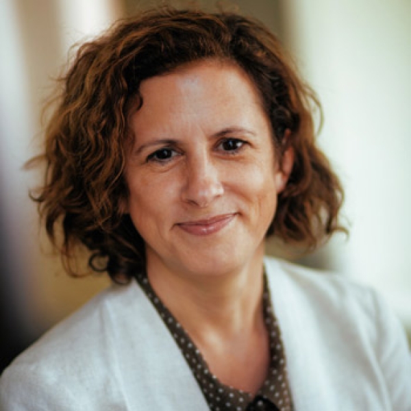
Dr. Jess Fanzo
Columbia Climate School

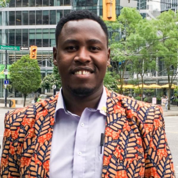
Ty Beal
Senior Technical Specialist
Host
Mark is a policy and advocacy specialist. He joined the Policy and Advocacy team at GAIN in March 2023. His role focuses on strengthening GAIN’s policy and advocacy work and its ability to engage with and influence global and national policy processes around food and nutrition security.
Mark Gachagua
Senior Associate, Policy Engagement and Advocacy Support
Contact Us
Do you have a question, idea, or feedback about the podcast? We would love to hear from you. Whether you’re reaching out about an episode, suggesting a guest, or exploring collaboration opportunities, feel free to get in touch and the team will respond as soon as possible.